
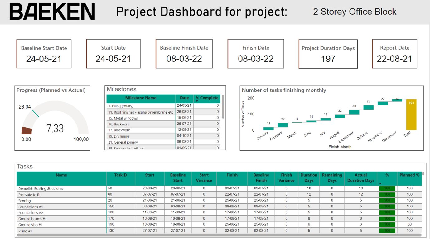
In complex projects, it is essential that stakeholders have quick and easy access to the most up-to-date information. A dashboard helps to visualize project data from different systems such as planning data, production data, risk analyses, time-recording systems, and safety systems. Dashboards differ from traditional reports in that the latter are often static and compiled manually, while a dashboard offers dynamic, real-time insights that can be adapted to the specific needs of the user.
Project teams often receive information in a fragmented way, via e-mails, PDFs and different systems. As a result, it is difficult to maintain a comprehensive overview. This is where a dashboard comes in, bringing all relevant data together in one place. Project teams can then easily access the most important information, which not only creates an effective overview, but also speeds up decision-making and improves collaboration.
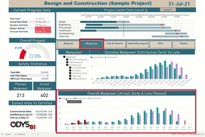
Unlike thick reports with static graphs, a dashboard offers flexibility. Users can apply filters to see only the data relevant to them. This makes the information directly applicable and transparent, which is crucial for making quick, data-driven decisions. Whether it concerns the status of Key Performance Indicators (KPIs) or trends in risk management, a dashboard always provides an up-to-date picture of the project’s status.
During the development of dashboards, our first question to the client is usually: “What do you want to know?” Oftentimes the answer is simple, for example: “Is the project going well?” This is often visualized as a traffic light. However, we know from experience that project performance is much more complex. We help clients by applying best practices, so that the dashboard not only shows whether a project is going “well”, but also provides insight into underlying trends and risks.
Another important aspect is the quality of the data. Data quality issues often come to light during the setup of dashboards. By providing insight into these issues, we can work with the client to improve processes. In this way, a dashboard not only provides better insight, but also optimizes the underlying systems.

At BAEKEN, we predominantly use Microsoft Power BI because of its extensive visualization options and user-friendliness. Power BI allows us to integrate information from different systems and offers extensive options for creating dynamic and interactive dashboards.
Want to know more about this topic?